01 Project Prompt
Sharpen.io
Glass Paddle began as a randomly generated project via Sharpen.io.
This prompt just clicked for me, as I have an interest in art and art galleries, having frequented local art walks with friends for many years. During the pandemic, we were forced to cancel most of our typical monthly art walks, leading this prompt to present an opportunity: to connect artists and art lovers, even when separated by space and time. This project aims to develop an art auction app for art galleries + artists, allowing people to digitally browse, bid on art, & connect with others.
02 USER RESEARCH
Online Foundational Research
General online research was done to see what currently exists in the world of art auction apps & websites, their pain points, and their user base.
Google Forms Survey
Gathering Insight: 20 LinkedIn & Facebook community survey responses on users’ experiences with auctions, buying artwork, and points of interest / concern with app based purchasing.
Zoom User Interviews
3 In-depth user interviews to gain an understanding of how best to build an art auction app to serve real users needs.
Miro Board Theme Identification
The insights from the Google Survey & interviews were collected and analyzed using affinity mapping in Miro Board.
Common themes to address in the design stage were identified.
03 Persona Development
Two Distinct Personas
User personas were generated based upon the demographic information collected from the survey, the zoom interview participants, & indirect research.
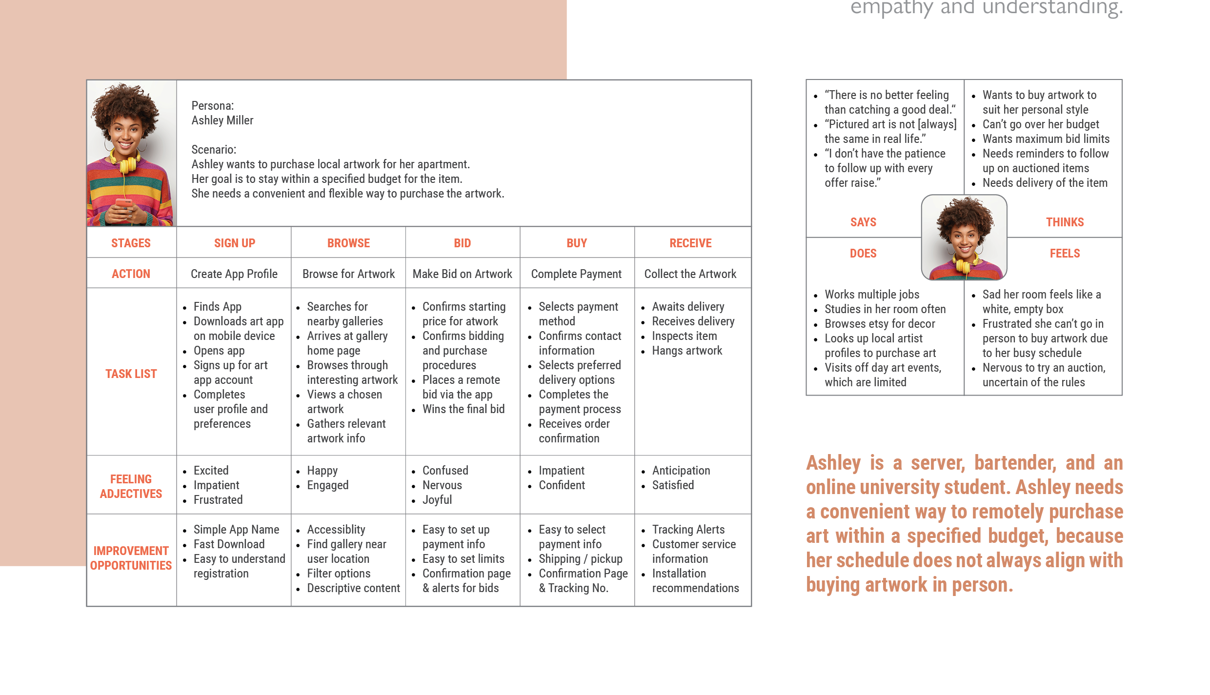
04 User Empathy Maps,
User Journey Maps,
& Problem Statements
Mapping the Users
The two personas were explored further to increase empathy and understanding.
05 Competitive Audit
Direct & Indirect Competition
06 User Flow Diagram
User Task
Sign up, find an artwork at a local gallery, place a bid, and receive order confirmation.
07 Story Boards
Overall Storyboard
Scenario: An art auction app that allows users to bid on artwork remotely.
Close Up Storyboard
Scenario: Art auction app sign up, browsing, and remote bid process screens.
08 Low-Fidelity Wireframes
Sketches & Figma Wireframes
These wire frames follow the user flow diagram and user storyboards.
09 Low-Fi User Testing
Figma Prototype
The Figma file was expanded to include additional app screens. Various image, text, and text field symbols were converted to linked buttons to enable the simulatation of several user flows. This clickable prototype will allow for testing of the low-fi design by potential users.
Maze Testing: 5 Users
5 participants were asked to complete a series of tasks. These tasks simulated setting up a new user profile, populating profile information, searching for an art gallery, selecting artwork, placing a maximum bid on artwork, and placing a quick bid on an item that the user was losing out on. The click paths, reactions, and user feedback were recorded in a spreadsheet.
10 Affinity Diagramming
Miro Board
Common themes and quotes from the user tests were categorized on a Miro Board to help clarify positive moments and pain points. This provides the next steps in the app design.
User A: Yellow Notes
User B: Green Notes
User C: Pink Notes
User D: Teal Notes
User E: Blue Notes
Themes:
Sign Up Process Needs Flexibility
Users Want to Instantly Browse
The Bid Page is Overwhelming
Quick Bidding is Confusing
11 Research Insights & Revised Designs
12 Visual Style
13 High - Fidelity Screens
Follow the Link to the Figma File in Process: Figma File


